FX Transact
Ensuring seamless FX processing from trade to settlement
Industry
Finance
Enviroment
Desktop
Co-initiated and led the design for FX Transaction Manager, an extension of the execution trading application for a Tier-1 Global Investment Bank–defining core interaction and visual design into one cohesive layer to execute and settle cross-border exposures.


Unlike traditional mobile games, this app facilitates face-to-face interaction rather than replacing it.
Players gather in person. Each round begins with the app assigning secret roles: All players receive the hidden word, but one unlucky participant is an "Imposter" and must bluff their way through the game. After everyone provides their clue, the group debates and votes to uncover the impostor.
Acting as a digital board, the app assigns secret words, manages roles, timers, and handles eliminations, letting players focus on laughing at each other's ridiculous clues.
From a design perspective, this meant designing an experience that was more felt than seen. The interactions needed to be intuitive enough that it faded into the background. Every tap, transition, and visual element had to reinforce that sense of fluidity, and effortless play.
Fluid disclosure
Beyond that, I wanted the app to feel playful yet polished, balancing bold and vibrant colours with clean typography. The colour palette shifted from an initial neon scheme to vibrant tones that felt more fun. Shapes were rounded to evoke friendliness, and animations were kept subtle and purposeful. Just enough to create moments of delight without pulling focus.

Vibrant colours evoked a sense of playfulness
Bright, bold, and beautifully intuitive
Players are greeted by a quick setup upon launching the game. A player-count slider adjusts the game size, while the role distribution frame let's players tweak the balance of civilians and imposters. The How to play button links to a tutorial to help newcomers settle right in.
Next, a colourful stack of cards slides in, each representing a player. The players must enter their names or select one from the saved players to reveal their secret words. This repeats until the last player, who then starts the game. The input expands to allow for avatar selection, a requested feature that adds a personal touch.
The 🤍 (save) button allows new players to save their names, so they don’t have to re-enter them in future rounds. This will particularly be useful for frequent players, as it streamlines the setup process and makes it easier to jump back into the game. The save button replaces the "saved players" button after a name is inputted.
The game unfolds in the voting and elimination phase. Players vote physically, and the app eliminates the most-voted player. Tapping a player's button triggers a confirmation modal to prevent misclicked eliminations. The rounds continue without eliminated players, until fatigue sets in.
Subtle visual cues were added to ensure there's a clear distinction between voting and elimination states.
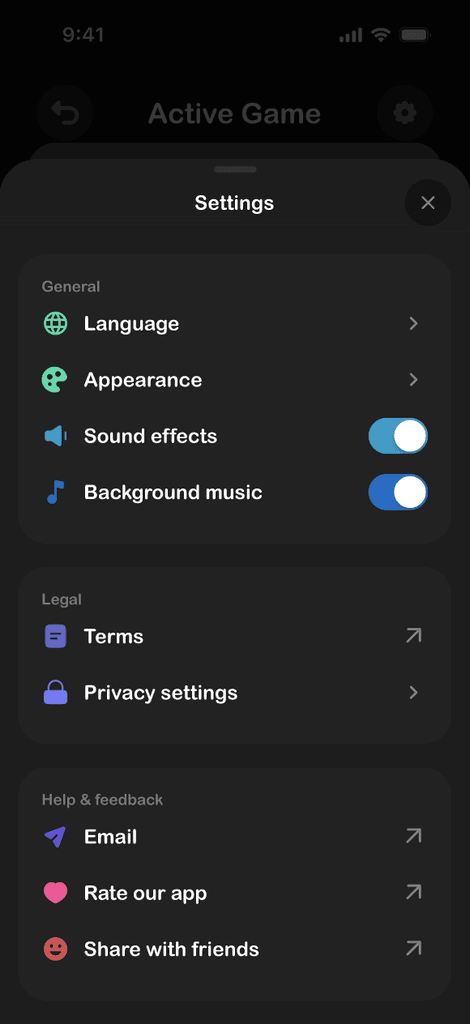
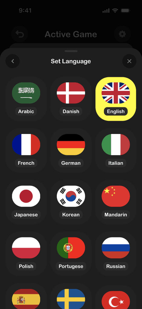
Beyond gameplay, the app includes accessibility and personalisation functions. Players can tweak various aspects of the experience, including sound, animations, and appearance preferences. Language settings, enable the game to be played in 15 different languages so players worldwide can enjoy the game comfortably in their native tongue.
I tested the game in a real setting during a New Year's games night with friends and family. The feedback was overwhelmingly positive, but seeing it played in the wild revealed small areas for improvement. I refined those details, tweaking interactions to make the experience even smoother.
This project was a return to something I had missed. After years in enterprise design, where precision and efficiency are paramount, I wanted to create something that felt alive and fun, and that goal influenced every decision.
Revisiting mobile design after so long was both refreshing and humbling. My first iteration was horrendous, lol. I had to go relearn mobile UI principles, fluid transitions, intuitive gestures, and the subtle ways UI can guide, rather than demand, attention. A game like this requires a framework, but it also needs to feel fluid and organic, never rigid.
Next, I’m looking to add real-time feedback and online multiplayer features, making the experience even more dynamic.
Back to top
All content, designs, and case studies on this website are my intellectual property. Unauthorized use, reproduction, or distribution of any material is strictly prohibited. For permissions, contact me at ali.adebolafuad@gmail.com
Last updated December 2024.